The Typography Trends Defining 2026
Typography never sits still. Every year, the way we use type evolves alongside technology, culture, and the ever-shifting tastes of the design community. And 2026 is shaping up to be one of the most exciting years for type in recent memory.
We have been tracking typography trends across web design, branding, editorial, and motion graphics, and the patterns are clear. Designers are getting bolder, more expressive, and more technically sophisticated with their type choices.
Here is what is happening right now and where we see things heading.
Variable Fonts Have Become the Standard
Let us start with the shift that underpins everything else. Variable fonts are no longer a “nice to have.” They are the baseline expectation for any serious web typography project in 2026.
Platforms Worth Checking Out



For those catching up: a variable font is a single font file that contains an entire range of styles along one or more axes. Instead of loading separate files for Regular, Medium, Bold, and Black, you load one file and specify exactly the weight, width, or optical size you want.
Why This Matters Now
Browser support for variable fonts hit 95%+ a few years ago, but adoption lagged because designers and developers were comfortable with static fonts. That inertia has finally broken.
The performance benefits are impossible to ignore. A single variable font file typically weighs less than two static font files, yet it gives you access to every weight and width in between. For performance-conscious teams, this is a game-changer.
But the real creative unlock is precision. Want a weight of 450 instead of choosing between 400 (Regular) and 500 (Medium)? Done. Need to animate weight on hover for a subtle interactive effect? Variable fonts make that possible with clean, smooth transitions.
Variable Fonts to Watch
Fraunces continues to be one of the most creative variable fonts available, with axes for weight, optical size, softness, and “wonk.” Recursive offers a fascinating spectrum from sans-serif to monospaced within a single file. And Inter remains the gold standard for variable sans-serif web typography.
Oversized Typography Is Everywhere
Big type is not new, but the scale has escalated dramatically. We are seeing headlines that fill entire viewport heights, letterforms used as structural design elements, and type that refuses to be ignored.
This trend is being driven by a few forces working together.
First, larger screens. With widescreen monitors, large tablets, and even foldable phones, designers have more real estate to play with. Type that would have felt overwhelming on a 13-inch laptop screen feels perfectly proportioned on a 27-inch display.
Second, the scroll-based web. Modern websites are built around the scroll, and oversized type creates natural pauses and moments of impact as users move through a page.
Third, the desire to stand out. In a sea of clean, minimal websites that all look vaguely the same, massive typography is one of the most effective ways to create instant visual distinction.
The best examples of this trend use scale with intention. The oversized type is not just big for the sake of it. It is the primary visual element, replacing hero images or illustrations entirely.
The Serif Revival Is in Full Swing
For the better part of a decade, sans-serif fonts dominated digital design. Clean, geometric sans-serifs became so ubiquitous that entire articles were written about how every tech company logo looked the same.
That era is over.
Serifs are back in a big way, and they are not just returning to their traditional roles. We are seeing serifs used in contexts that would have been unthinkable five years ago: SaaS landing pages, mobile app interfaces, e-commerce product pages, and even developer documentation.
What Is Driving the Serif Comeback
Screen technology has caught up. Modern displays render serif details crisply at virtually any size, removing the practical argument against serifs on screens.
There is also a cultural shift at play. After years of minimalist, tech-forward aesthetics, audiences are craving warmth, personality, and humanity in the brands they interact with. Serif fonts deliver all three.
The specific serifs gaining traction are not your grandfather’s Times New Roman. Designers are reaching for high-contrast transitional serifs, soft old-style faces, and modern serifs with just enough quirk to feel contemporary. Fonts like Zodiak, Sentient, and Newsreader are showing up in portfolios everywhere.
Brutalist Typography Pushes Boundaries
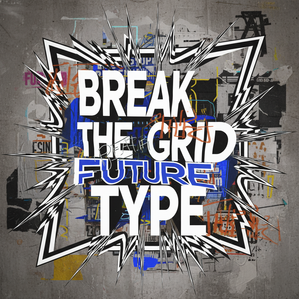
On the opposite end of the spectrum from refined serifs, brutalist typography continues to grow as a movement. This is type that is raw, confrontational, and deliberately uncomfortable.
Brutalist type design borrows its philosophy from brutalist architecture: expose the structure, reject ornamentation, and prioritise function (or the appearance of function) over beauty.
What Brutalist Type Looks Like in Practice
Tight or overlapping letter-spacing. Stark, monospaced fonts used at massive scale. Intentionally “broken” layouts where text collides with other elements. Mixed case, mixed sizes, and mixed fonts within the same headline.
It sounds chaotic, and sometimes it is. But when done well, brutalist typography creates a sense of urgency and authenticity that polished design simply cannot match.
This trend is particularly strong in music, fashion, independent publishing, and cultural institutions. Brands that want to signal that they are uncompromising and countercultural are gravitating toward brutalist type as a shorthand for those values.
The typefaces fuelling this trend include Neue Machina, Clash Grotesk, and various releases from Velvetyne Type Foundry, all available for free and all designed with expressive, boundary-pushing intent.
Kinetic Typography Goes Mainstream
Type that moves is no longer reserved for music videos and experimental art projects. Kinetic typography has become a core tool in the web designer’s kit, thanks to advances in CSS, JavaScript animation libraries, and browser rendering performance.
We are seeing three main applications of kinetic type in 2026.
Scroll-Triggered Animations
Text that reveals, transforms, or rearranges as the user scrolls. Libraries like GSAP and Framer Motion make these effects accessible to front-end developers without requiring a motion graphics background. The best implementations feel natural and purposeful, guiding the user through a narrative rather than showing off.
Variable Font Animations
Because variable fonts expose their axes as animatable CSS properties, designers can create smooth transitions between weights, widths, and other attributes. A headline that subtly shifts from light to bold on hover, or text that breathes by slowly cycling through widths, adds a layer of polish that static type cannot achieve.
SVG Text Effects
For more complex effects like text along paths, masking, clipping, and stroke animations, SVG text remains the go-to approach. The combination of SVG text with CSS animations creates possibilities that were previously only achievable in video editing software.
The key to kinetic typography done well is restraint. A single, well-executed text animation can define an entire page. Fifteen competing animations just create chaos.
Hand-Drawn and Imperfect Lettering
In direct response to the AI-generated perfection flooding the design landscape, hand-drawn lettering and intentionally imperfect typefaces are having a moment.
This trend reflects a broader cultural desire for authenticity. When anyone can generate a polished logo or perfectly kerned headline in seconds using AI tools, the human touch becomes the differentiator.
We are seeing this play out in several ways. Custom hand-lettered logotypes for food and beverage brands. Rough, sketchy display fonts for independent publications. Typefaces with deliberate irregularities that mimic the imperfections of physical printing or handwriting.
Fonts like Caveat, Kalam, and various releases from independent lettering artists are gaining popularity, while custom lettering commissions are seeing increased demand from brands that want something no AI can replicate.
If you are exploring this trend, we keep a curated directory of creative resources at Design Flea where you can discover independent type designers and lettering artists alongside free font libraries.
Inclusive Typography Takes Centre Stage
One of the most meaningful typography trends of 2026 is the growing focus on inclusive type design. This goes beyond basic accessibility (though that matters enormously) into a broader conversation about who typography is designed for.
Readability-First Design
More designers are prioritising dyslexia-friendly typefaces, larger default font sizes, and generous spacing. Fonts like Atkinson Hyperlegible, designed by the Braille Institute, are being used not just as accessibility accommodations but as primary design choices because they look great and work for everyone.
Multilingual and Multi-Script Support
As the web becomes more global, demand for fonts with comprehensive language support is growing. The best free fonts of 2026 are those that support not just Latin characters but Cyrillic, Greek, Arabic, Devanagari, and other scripts. Google’s Noto font family, designed to cover every Unicode character, represents the gold standard here.
Gender-Inclusive Typography
In languages with grammatical gender (Spanish, French, German, and many others), typographers are creating new glyphs and ligatures to support gender-neutral writing. This is a niche but growing area that reflects typography’s role as a tool for social communication, not just visual design.
Variable Fonts for Accessibility
Variable fonts are becoming an accessibility tool in their own right. By exposing weight and width axes to the end user, designers can let readers adjust type to their own preferences. Some forward-thinking sites now offer typography controls that let visitors increase weight, spacing, or size beyond the default settings.
Colour Fonts and Chromatic Type
Colour fonts (also called chromatic fonts) embed multiple colours, gradients, or even bitmap textures directly into the font file. Browser support has improved enough in 2026 that we are starting to see practical applications beyond experimental showcases.
The most exciting use cases are in branding and social media, where colour fonts can replace static graphics for dynamic, scalable text elements. Imagine a headline where each letter contains a gradient that matches your brand palette, all rendered as selectable, accessible text rather than an image.
Google’s COLRv1 format is leading the charge, offering vector-based colour fonts with small file sizes and full browser support. We expect to see more foundries releasing colour font versions of popular typefaces throughout the year.
Retro and Nostalgic Type Styles
Nostalgia continues to be a powerful force in design, and typography is no exception. In 2026, we are seeing designers draw inspiration from several distinct eras.
1970s psychedelic and disco-era type with fat, rounded letterforms and groovy curves. These styles work particularly well for music, entertainment, and lifestyle brands.
1990s rave and grunge typography with distressed textures, chaotic layouts, and a DIY punk aesthetic. This overlaps significantly with the brutalist trend.
Y2K and early-internet aesthetics with pixel fonts, system font nostalgia, and references to early web design. As the generation that grew up with these aesthetics enters the workforce, they are bringing those visual references into mainstream design.
The trick with nostalgic typography is to reference the past without recreating it wholesale. The best examples take vintage type styles and pair them with modern layouts, colours, and interactions, creating something that feels simultaneously familiar and fresh.
What These Trends Mean for Your Work
Not every trend is right for every project, and chasing trends for their own sake is a recipe for dated-looking work. But understanding where typography is heading helps you make more informed decisions.
If we had to distill 2026’s typography trends into a single theme, it would be this: expressiveness with intention. Designers are moving away from safe, predictable type choices and toward bolder, more personal ones. But the best work is not bold for the sake of it. It is bold because the project demands it.
Use variable fonts because they perform better and give you more control. Use oversized type when the message warrants commanding attention. Use a serif because it genuinely suits the brand, not because it is trendy. Use brutalist type because the project calls for raw energy, not because you saw it on a design blog.
Typography is always a tool in service of communication. The trends change, but that principle does not.
You might also find our guide to typography fundamentals useful.
You might also find our guide to font pairing guide useful.
For further reading, check out Typewolf.
Frequently Asked Questions
Variable fonts are single font files that contain an entire range of styles, including different weights, widths, and other design attributes. They are trending because they offer better web performance (fewer files to load), greater design flexibility (you can choose any weight between Light and Black, not just predefined steps), and enable smooth CSS animations between styles. Browser support is now virtually universal. It depends on the brand’s personality and audience. Brutalist typography works well for creative agencies, fashion labels, cultural institutions, and any brand that wants to project an unconventional or countercultural identity. It is generally not a good fit for healthcare, finance, or other industries where trust and approachability are paramount. The key is matching the typographic style to the brand’s values and audience expectations. Three main reasons. First, high-resolution screens now render serif details beautifully, removing the old concern about serifs looking blurry on screens. Second, designers are seeking warmth and personality to differentiate brands in a landscape dominated by identical-looking sans-serif websites. Third, a broader cultural shift toward heritage, craft, and human touch is making traditional typographic styles feel fresh again. Start with the fundamentals: use a minimum body text size of 16px (we recommend 18px or larger), maintain a colour contrast ratio of at least 4.5:1, set line height to 1.5 or greater, and keep line lengths between 50 and 75 characters. Beyond that, consider using fonts designed for readability like Atkinson Hyperlegible, provide user controls for adjusting text size and spacing, and choose fonts with comprehensive language and character support for multilingual audiences. Follow trends when they genuinely serve your project, and stick with classics when stability and timelessness matter more. A portfolio website or creative campaign can benefit from trendy type choices because they signal awareness of current design culture. A corporate website or long-lasting brand identity might be better served by proven classics that will not feel dated in two years. The best approach is to stay informed about trends while making decisions based on the specific needs of each project.What are variable fonts and why are they trending in 2026?
Is brutalist typography appropriate for professional brands?
Why are serif fonts making a comeback in web design?
How can I make my typography more accessible and inclusive?
Should I follow typography trends or stick with classic choices?




Leave a Comment