
15 Visual Identity Examples That Nail Consistency Across Every Touchpoint
A logo is not a visual identity. A colour palette is not a visual identity. Even a beautifully designed website is not, on its own, a visual identity.
A visual identity is the complete system that ensures a brand looks, feels, and communicates consistently everywhere it shows up. Website, business card, social media, packaging, signage, email templates, trade show booths, employee uniforms. Every single touchpoint telling the same visual story.
That level of consistency is extraordinarily difficult to achieve. It requires strategic thinking, meticulous documentation, and a design system flexible enough to work across wildly different formats while remaining unmistakably cohesive.
We’ve gathered 15 visual identity examples that do this brilliantly. Each one demonstrates a different approach to building and maintaining consistency, and each offers lessons you can apply to your own brand.
Platforms Worth Checking Out



1. Apple
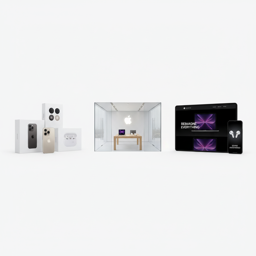
Apple’s visual identity is the benchmark that every other brand measures itself against. The consistency is almost eerie. Whether you’re visiting apple.com, walking into an Apple Store, unboxing a product, or reading a billboard, the experience is seamless.
nn
nn
What makes it work: Ruthless simplicity. Apple uses an extremely limited visual vocabulary (clean photography, generous white space, San Francisco typeface, monochromatic palette with selective colour accents) and applies it with absolute discipline. Every piece of communication feels like it came from the same mind.
Key lesson: Constraint creates consistency. The narrower your visual system, the easier it is to maintain across touchpoints.
2. Airbnb
When Airbnb introduced its “Belo” symbol and redesigned identity in 2014, it created a visual system built for a brand that lives primarily in digital spaces but needs to feel human and warm.
What makes it work: The Belo symbol works at every scale, from a tiny app icon to a massive building sign. The photography style (authentic, warm, real people in real spaces) is consistent across every platform. The colour system uses a coral-red primary that’s distinctive enough to own. And the illustration style adds personality without undermining the clean, modern foundation.
Key lesson: Design your identity system for your primary medium first, then adapt outward.
3. Coca-Cola
Coca-Cola has maintained visual consistency for over a century, which is a feat almost no other brand can claim. The Spencerian script, the specific shade of red, the dynamic ribbon, and the contour bottle shape are recognisable anywhere in the world.
What makes it work: Coca-Cola proves that consistency doesn’t mean rigidity. The brand refreshes its visual expression regularly (campaigns, seasonal packaging, limited editions) while never abandoning its core visual elements. You always know it’s Coca-Cola, even when it looks different from last time.
Key lesson: Identify the non-negotiable visual elements that define your brand and protect them fiercely, while allowing everything else to evolve.
4. Stripe
Stripe’s visual identity proves that B2B brands don’t have to be boring. The payment processing company uses gradient colour, sophisticated typography, and thoughtful animation to create a visual system that feels both technical and beautiful.
What makes it work: Stripe’s identity is built on a distinctive gradient palette that shifts from purple to blue to teal. This gradient appears across the website, documentation, marketing materials, and even developer tools. Combined with clean layouts and the custom typeface, every touchpoint feels unmistakably Stripe.
Key lesson: A distinctive colour treatment can be as recognisable as a logo when applied consistently.
5. Aesop
The Australian skincare brand has built one of the most respected visual identities in retail. Every store, every product, and every piece of communication shares the same DNA: quiet sophistication, typographic precision, and a deep respect for materiality.
What makes it work: Aesop’s genius is in its physical spaces. Each store is architecturally unique, designed to respond to its specific location, yet every single one is instantly recognisable as Aesop. The consistent elements (amber bottles, serif typography, natural materials, muted palette) create coherence without uniformity. The Design Flea directory features many brands aspiring to this level of visual coherence.
Key lesson: Consistency doesn’t mean sameness. You can adapt to context while maintaining identity through a carefully chosen set of brand constants.
6. Spotify
Spotify’s visual identity has evolved significantly since its launch, but the current system is one of the strongest in tech. The duotone photography treatment, bold colour palette, and dynamic layouts create a visual language that’s instantly recognisable across billboards, app interfaces, social media, and wrapped campaigns.
What makes it work: Spotify’s identity is designed for motion and variety. The system includes guidelines for colour application, photography treatment, and layout that are specific enough to ensure consistency but flexible enough to accommodate the diverse range of artists, genres, and moods the brand needs to represent.
Key lesson: Build flexibility into your system from the start. If your brand needs to represent diverse content, your identity system needs rules that accommodate variety.
7. Nike
The Swoosh is arguably the most recognised brand mark on Earth. But Nike’s visual identity extends far beyond its logo. The brand’s visual system includes a distinctive approach to photography (high-contrast, athletic, aspirational), bold typography, and a black-and-white foundation that lets product colour take centre stage.
What makes it work: Nike’s identity is athlete-first. Every visual decision serves the goal of making the product and the athlete look powerful. The brand uses the same visual language whether it’s selling running shoes, basketball gear, or lifestyle apparel. The Swoosh unifies everything, but it’s the consistent visual attitude that truly holds the identity together.
Key lesson: Your visual identity should serve your core story. When every visual choice reinforces the same narrative, consistency feels natural rather than forced.
8. Mailchimp
Mailchimp’s 2018 rebrand transformed it from a quirky email tool into a full-fledged brand with one of the most distinctive visual identities in SaaS. The combination of custom illustrations, the Freddie mascot, a banana-yellow palette, and the Cooper Light typeface creates a visual world that’s utterly unique.
What makes it work: Mailchimp’s identity proves that personality and professionalism aren’t mutually exclusive. The illustration system is particularly impressive. Hundreds of unique illustrations share the same visual DNA (specific line weights, colour palette, sense of humour) so they feel cohesive even when the subject matter varies wildly.
Key lesson: Invest in custom visual assets (illustrations, icons, photography styles) that competitors can’t replicate. They become the most defensible part of your identity.
9. Muji
Muji’s visual identity is built on the radical idea of “no brand.” The name itself means “no-label quality goods.” The visual system strips away everything that traditional branding adds: loud colours, decorative logos, aspirational imagery.
What makes it work: Muji’s consistency comes from what’s absent rather than what’s present. The beige and brown palette, the clean sans-serif typography, the unadorned product photography, and the minimal packaging all communicate the same message: the product speaks for itself. This anti-branding approach is, paradoxically, one of the most recognisable visual identities in retail.
Key lesson: A visual identity can be built on restraint as powerfully as it can be built on expression. Knowing what not to do is as important as knowing what to do.
10. Duolingo
Duolingo has built one of the most recognisable brand identities in edtech through a combination of its green owl mascot, vibrant colour palette, playful illustrations, and a visual system designed entirely around making learning feel like a game.
What makes it work: Every visual element reinforces the core brand promise of making language learning fun and accessible. The character illustrations are consistent across the app, social media, advertising, and merchandise. The colour system is bright and energetic without being childish. And the brand’s willingness to let Duo (the owl) become a social media personality adds an entirely new dimension to visual consistency.
Key lesson: A strong character or mascot can become the anchor of your entire visual system and extend your brand into contexts that traditional design elements can’t reach.
11. IBM
IBM’s visual identity, rooted in Paul Rand’s iconic 1972 logo design, is a masterclass in longevity. The eight-bar logo, the blue palette, and the systematic approach to visual communication have remained fundamentally consistent for over fifty years.
What makes it work: IBM invested heavily in design systems long before the term was trendy. The IBM Design Language is a comprehensive framework covering colour, typography, iconography, layout grids, and motion. This documentation ensures that whether a design is created by an internal team in New York or an agency in Tokyo, it looks and feels like IBM.
Key lesson: Documentation is the secret to long-term visual consistency. The more thoroughly you codify your visual system, the more consistently it will be applied.
12. Glossier
Glossier’s visual identity changed the beauty industry’s visual language. Where luxury beauty brands used black, gold, and high-fashion photography, Glossier introduced millennial pink, dewy skin, minimal makeup, and a visual vocabulary that felt more like a best friend’s recommendation than a corporate beauty brand.
What makes it work: Glossier’s visual identity is consistent because it’s rooted in a clear point of view about beauty: skin first, makeup second, and real over perfect. This philosophy guides every visual decision, from the product photography (real skin textures, minimal retouching) to the packaging (simple, sticker-friendly, Instagram-ready) to the retail spaces (pink, soft, selfie-optimised).
Key lesson: When your visual identity is driven by a genuine philosophy rather than just aesthetic preferences, consistency becomes organic.
13. Mastercard
Mastercard’s 2016 identity refresh by Pentagram simplified the brand to its most essential elements: two overlapping circles in red and orange. The brand even dropped the wordmark entirely in 2019, trusting the symbol alone to carry recognition.
What makes it work: The interlocking circles work at every scale and in every context. On a credit card, an app icon, a point-of-sale terminal, or a stadium sponsorship. The sonic identity (a distinctive audio signature) extends the visual consistency into sound. Every touchpoint feels connected.
Key lesson: If your mark is strong enough, it can carry your entire identity. Invest in a symbol that communicates without words.
14. Patagonia
Patagonia’s visual identity reflects its values with perfect consistency. The mountain silhouette logo, the earthy colour palette, the documentary-style photography, and the straightforward typography all communicate the same thing: we care about the planet more than we care about looking polished.
What makes it work: Every visual choice Patagonia makes is filtered through its environmental mission. The photography shows real landscapes, real athletes, and real environmental challenges. The catalogue design prioritises storytelling over product glamour. Even the worn, vintage quality of many visual assets is intentional, communicating durability and timelessness.
Key lesson: A brand’s values are its most powerful tool for visual consistency. When every design decision is tested against a clear set of values, coherence follows naturally.
15. Notion
Notion has built a visual identity that feels warm and creative in a space dominated by cold, utilitarian interfaces. The hand-drawn illustrations, clean typography, and black-and-white palette with selective colour create a visual system that’s both professional and personal.
What makes it work: Notion’s illustration system is the star. The hand-drawn characters and objects appear across the product interface, marketing materials, social media, and documentation. They add humanity to a productivity tool without undermining its credibility. The consistent line weight, style, and personality across hundreds of illustrations demonstrate exceptional system thinking.
Key lesson: Custom illustration systems, when executed with true consistency, can become as recognisable as a logo. They also scale beautifully across touchpoints in a way that photography often can’t.
What These Visual Identity Examples Have in Common
Despite their differences in style, industry, and scale, these 15 brands share several traits that make their visual identities exceptional.
They start with strategy. Every visual choice is rooted in a clear understanding of what the brand needs to communicate and to whom.
They define non-negotiables. Each brand has a small set of visual elements that never change, creating a stable foundation that allows everything else to flex.
They invest in systems. These aren’t ad hoc collections of good-looking assets. They’re documented, principled systems with clear rules for application.
They think across touchpoints from the start. The identity isn’t designed for one medium and then awkwardly adapted. It’s conceived as a multi-platform system from day one.
They evolve without losing themselves. Every brand on this list has updated its visual identity over time, but none has lost its essential character in the process.
Building a visual identity this consistent takes time, investment, and discipline. But the payoff is a brand that’s instantly recognisable, deeply trusted, and built to last.
You might also find our guide to brand identity design guide useful.
You might also find our guide to logo design inspiration useful.
For further reading, check out Brand New by UnderConsideration.
Frequently Asked Questions
A visual identity is the collection of visual elements that represent a brand, including the logo, colour palette, typography, imagery style, iconography, and layout principles. Brand identity is a broader concept that also encompasses voice, tone, messaging, values, and the overall experience a brand creates. Think of visual identity as the visible layer of brand identity. It’s what people see, while brand identity also includes what people hear, read, and feel. A thorough visual identity system should cover every touchpoint where your brand appears. At minimum, this includes your website, social media profiles, email communications, business cards, and any product packaging. For larger brands, it extends to advertising, signage, trade show materials, employee communications, investor presentations, and physical spaces. The key is identifying every point of contact between your brand and its audiences and ensuring visual consistency across all of them. There’s no fixed timeline, but most successful brands make minor refinements every 3 to 5 years and consider more significant refreshes every 7 to 10 years. The trigger for an update should be strategic (the brand has evolved, the market has shifted, the current identity no longer communicates accurately) rather than aesthetic (we’re bored with it). Major redesigns carry risk, so they should be driven by genuine business need rather than trend-following. Flexible visual identity systems are built on a hierarchy of fixed and variable elements. Fixed elements (like the logo, primary colour, and core typeface) stay consistent everywhere. Variable elements (like secondary colours, photography style, and layout approaches) can adapt to the requirements of different platforms. The best systems also include specific guidelines for challenging formats, such as social media avatars, email signatures, and favicon sizes. Small businesses can absolutely build strong visual identities. In fact, smaller brands often have an advantage because fewer people are creating brand materials, which means fewer opportunities for inconsistency. Start with the essentials: a well-designed logo, a clear colour palette, one or two typefaces, and basic guidelines for how these elements work together. Even a simple one-page brand guide can dramatically improve consistency and make your small business look as professional as brands ten times your size.What is a visual identity and how is it different from a brand identity?
How many touchpoints should a visual identity system cover?
How often should a brand update its visual identity?
What makes a visual identity system flexible enough for different platforms?
Can small businesses create strong visual identities or is it only for large companies?




Leave a Comment